|
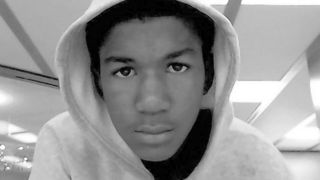
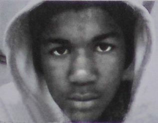
Is the photograph of the hooded, young-looking Trayvon Martin a fake?
I don’t know that this is true, but as a reader pointed out to me the other day, and initially I was dismissive (and I forget at the moment who the reader was), Riehl World View reports that the most widely published photograph of Trayvon Martin
is a retouch job. The blog says that the original version of the photo, published in the Miami Herald on March 22, looks like this:
And it’s not just the blogger saying it. Take a look at the story and photo in the March 22 Miami Herald.
Can this be true? To me, the more mature and darker photo looks more like a re-touch job than the younger looking photo. However, we see the more mature photo right there in the Herald. I’ve just saved the Herald webpage in the event they go back and change the photo to make it conform to the later published version.
I agree with you that the darker photo looks tampered with.Rob S. writes:
I think the Miami Herald picture is a photo of a sign carried by a protester. It’s not an accurate representation of the original photo.Paul K. writes:
I work with Photoshop, though I’m far from an expert with it. To me, it seems more likely that someone lightened up the darker photo than the other way around. I did about five minutes work on the darker photo as an example. The lighter photo is strangely lit—we have strong blacks on the cap and T-shirt Trayvon is wearing under his hoodie, yet we see few dark contrasts where we would expect them on his face, such as along the bridge of his nose or his cheeks. His skin looks washed out. In Photoshop, it is easy to mask off the face, lighten it, and reduce the contrasts, while keeping the black of the eyebrows and pupils. On the other hand, to take the lighter photo and make it darker, it would be necessary to paint all those shadows in and do it convincingly.Gintas writes:
The darker one looks more real. It looks like the kind of picture you get from a flashless low-quality webcam or cellphone camera, grainy and bad contrast, and it was taken with lights in the background, which would underexpose the subject. The top one looks cleaned up.LA writes:
The strongest evidence for believing that the darker, more menacing photo is not real (or, alternatively, that it is a photo of a poster and thus distorted) is that there is no other photograph of Trayvon in which he is so dark and his features are so thick and heavy. In all his other photographs, including his more recent, thuggish looking ones, like the photo where he’s wearing a “grill,” his features, particularly his nose, are “finer” (i.e. thinner) than that and his skin is lighter. So I reject Riehl World View’s claim that the photo in the Miami Herald is the real Trayvon.Paul K. writes:
I have come around to your view on this. I looked for the earliest, highest resolution example of the Trayvon photo I could locate. It’s on The Daily from March 23. It looks perhaps slightly darker than it does in some reproductions, but not much. I then played with the contrasts in Photoshop and came up with the darker image which is similar to that reproduced in the Miami Herald. I find it hard to believe that someone would do that deliberately, but it might be a result of a second-generation image (photo of a photo) as you said.April 26 Photo Guy in North America writes:
I have just noticed Paul K.”s comment and the photograph he links to. This has more in the frame and is darker: as such what I concluded is the original has been cropped and lightened, although not overly so. My analysis of the typical alterations is still valid, but I must point out my error here. It is truly surprising how many versions of this image are floating around! Just when you think you have found the original, another appears! Posted by Lawrence Auster at April 25, 2012 08:19 AM | Send Email entry |

